A strong call to action (CTA) can mean the difference between a visitor who clicks away and one who donates, volunteers, or signs a petition. However, many nonprofits unintentionally bury or confuse their CTAs with vague language, poor placement, or visual clutter.
Whether your organization focuses on education, healthcare, the arts, or humanitarian aid, your nonprofit CTAs must be clear, motivating, and easy to act on. Let’s explore practical tips for designing CTAs that inspire supporters to take the next step.
Write Clear, Action-Oriented Language.
The words you choose matter. Effective CTA copy uses specific, urgent, and emotionally compelling language that drives action. It quickly answers the supporter’s question: “What should I do next?”
Keep these principles in mind when writing your CTAs:
- Start with a strong verb. Words like Donate, Volunteer, Share, and Call tell supporters exactly what to do.
- Specify the action and its purpose. “Provide a meal to a family in need” or “Double your impact with a corporate match” is far more motivating than “Click here.”
- Match tone to urgency. A request for emergency disaster relief requires urgent language, whereas an invitation to an annual gala might use a more inviting or celebratory tone.
For inspiration on CTA wording, look to successful advocacy campaigns, which excel at driving immediate user behavior. Even if your nonprofit isn’t political, these examples offer a masterclass in clarity. Check out Cornershop Creative’s list of nonprofit advocacy examples for examples like Save the Children Action Network’s website:
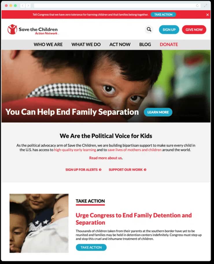
You’ll notice several clearly worded CTAs that encourage visitors to “Take Action,” “Give Now,” “Sign Up for Alerts,” or simply “Learn More.” The action-oriented wording inspires users to click whichever option best applies to their needs, leading to our next piece of advice.
Align CTAs With The User’s Journey.
Not every supporter is ready for the same action at the same time. The key is to design CTAs that support realistic goals while also ensuring that your content meets your target audience where they are. Here’s what that might look like for an animal shelter’s website:
- For new visitors: “Sign up for our Pet of the Week emails.”
- For regular readers: “Share this adoption story on social media.”
- For long-time supporters: “Make a recurring gift to sponsor a kennel.”
- For deeply engaged advocates: “Apply to become a foster parent.”
By tailoring your CTAs to audience readiness, you create a ladder of engagement that gradually moves people from awareness to deep commitment.
Beyond the user’s readiness, you should also consider the platform you’re using. CTAs in an email allow for personal, segmented outreach, while website CTAs should be bold and urgent.
You should also lean into each platform’s natural strengths. For example, Meyer Partners’ donor acquisition guide recommends encouraging social media users to donate or subscribe to your post feeds. Meanwhile, direct mail recipients might be better served with a request to return a physical reply card or visit a specific page on your website. By matching your ask to the medium, you reduce friction and increase the likelihood of response.
Use Visual Design To Draw Attention to Your CTAs.
Even the most compelling words won’t matter if your CTA buttons blend into the page or take three scrolls to reach. Good design makes them impossible to miss.
To make your nonprofit CTAs shine and drive action, focus on these key visual elements:
- Bold, high-contrast colors. Your buttons should pop off the screen. Choose a color that contrasts sharply with your background while remaining true to your brand palette.
- Above-the-fold placement. Don’t make users hunt for the next step. Position your most critical CTA at the top of the page so it is visible immediately without scrolling.
- Whitespace. Give your buttons room to breathe. Surrounding CTAs with empty space prevents them from getting lost in busy layouts or paragraphs of text.
- Consistency. Train your visitors to recognize clickable elements by using the same button shape and size across your entire site.
- Subtle animations. Use simple hover effects or animations to signal that a button is clickable, adding polish without distraction.
Most nonprofit website builders allow you to easily customize these styles, so you can keep your design fresh as your campaigns evolve. Remember: highly visible, accessible CTAs remove friction, clearing the path for your supporters to take meaningful action.
Continuously Test and Optimize Your CTAs.
Launching your CTAs is just the beginning. Testing is essential to refine your message for maximum impact, whether you’re focusing on driving donations, event registrations, volunteer signups, or other key actions. Use these strategies to ensure your CTAs always perform at their best:
- Run A/B tests. Don’t rely on guesswork. Test two versions of a button—perhaps changing the color or the text (e.g., swapping “Donate” for “Give Hope”)—to see which one drives more clicks.
- Analyze heatmaps. Use visual tools to see exactly where visitors scroll and click. This helps you identify if users are getting distracted by other elements before they even reach your call to action.
- Track key metrics. Click-through rates and conversion percentages are your truth-tellers. If a page has high traffic but low clicks, you know the CTA needs a refresh.
- Keep it fresh. Even the best CTAs can go stale over time. Update your buttons to reflect new campaigns, seasons, or urgent needs.
Sometimes even small tweaks can boost conversions—changing “Donate” to “Protect Wildlife Today” adds urgency and specificity. Tools like Google Analytics provide the insights needed to measure what works.
Freshen Up Your CTAs.
As your nonprofit grows, your CTAs should evolve too. Outdated or unclear CTAs can create confusion and reduce engagement.
Start by reviewing your highest-traffic pages, like your homepage, service pages, or advocacy alerts, and ask: “Are our CTAs clear, visible, and aligned with visitor intent?” If not, update them and track how engagement improves. Refreshing your copy and design helps cut through digital noise and ensures your asks remain relevant.
Ultimately, calls to action aren’t just buttons. They’re the bridge between your mission and your supporters’ impact. With clear language, smart design, and consistent optimization, your nonprofit can turn passive interest into lasting impact.