Your nonprofit website might be one of your most important assets when it comes to collecting donations and acquiring new clients or members, but all too often it’s also the most overlooked and forgotten part of your organization. That’s why there are so many nonprofit websites out there that are functional but lack the pizzazz to attract new donors and clients. Don’t let this happen to you by avoiding these three common mistakes when building your nonprofit website or redesigning an existing one.

Don’t hide the donate button
Yes it seems simple and many websites have improved on this important topic, but the donate button is still either somewhat hidden, small, or obscured on many pages.
This is understandable—you don’t want to seem like you’re soliciting donations at every turn—but hiding your donate button isn’t going to fool anyone. You have a nonprofit website because you need funding, so let people know that upfront! If a visitor lands on your page and feels no reason to stick around, you might as well have left that money in their pocket.
How to jazz up your donate button:
- Make it prominent on the page. They are often located in the upper right-hand corner of the page, but you should also make it larger than other buttons or navigation choices, so it’s easy to see.
- Use a bold color palette. It doesn’t have to clash or be annoying like a firework stand advertisement, but make it stand out from everything else on the page. You want it to be one of the first things the eye naturally notices. Use complementary colors to your brand colors, but some of the boldest ones you can comfortably get away with.
- Simple function: Keep the link basic, one link = one page. Take the donor directly to a donation page/section. Every page you put between your donor and the final donation page will lose more potential donors.
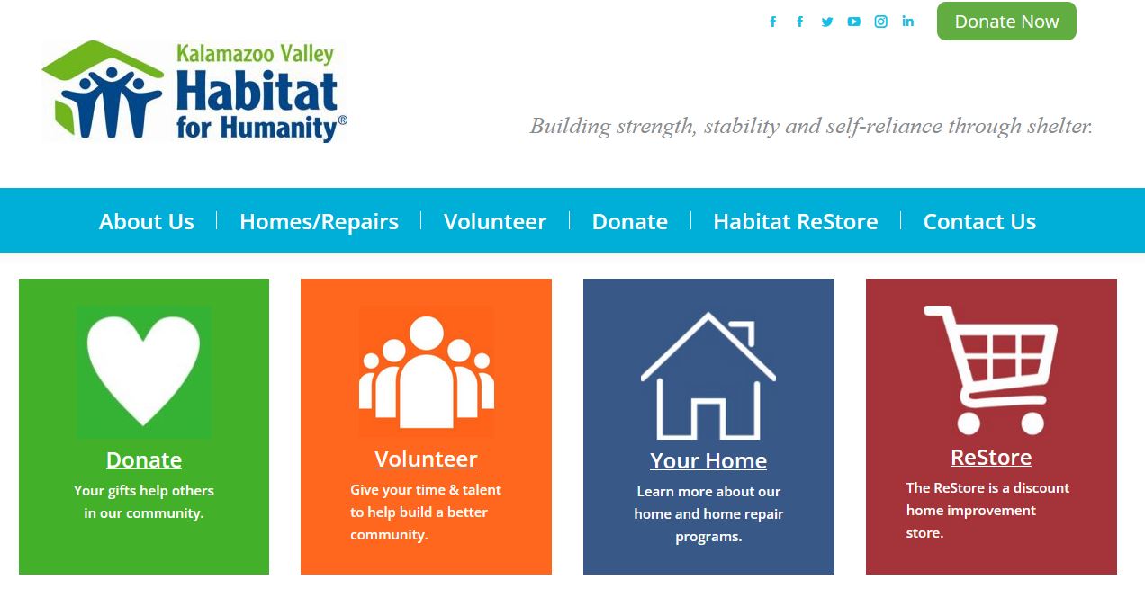
A great example is what Habitat for Humanity in Kalamazoo, Mich. has built. A nice bold green button in the corner using their color palette. And they also have a second donation button down below. While this could be a little overkill, no one is going to miss these donation buttons. It’s easy and simple to access. And they go directly to the donate page, one click and a donation can be made.
And you may want to go the extra mile on special occasions and even set up a pop-up window for donations. Like for example if you have a limited time donor match, or during a big donation day like Giving Tuesday. Or even around the end of the year for last minute donations. The popup window can instantly bring a viewer’s attention to a donation ask and really increase potential donations.

Focus on Your Mission
A strong sense of purpose is crucial for a successful nonprofit website. It helps you communicate more effectively with your audience by making them feel like their needs are being addressed directly.
Share what makes your nonprofit special. Your core goal and focus. And you can do that by telling a story with photos, but make sure it is a simple, direct story.
Ideally, you want a story that needs few words but is dynamic in presentation and draws the eye. And you may need special professional photography to get a great photo. Be sure to explain to the photographer what you’re looking for if you go this route.
Show don’t tell is the old saying. That holds very well here as people often will not stop to read long pieces, but will want to get a better idea about your nonprofit’s goal and focus.
Harvest Hope does an amazing job of showing their success and exactly what they do in photos and videos at the top of their page. It’s simple but it speaks immediately to their mission. You instantly understand what Harvest Hope does.
Short videos can be great for this purpose as well. But nothing very long. You want to just give a sense of who you are and what you do. Not tell the full story with all details.

Keep your clients in mind
While the tips above are great, there’s also the issue of function. Some people may likely come to your website for an actual purpose related to your mission. For example, to find your location of your office or stores. Or to sign up for a service you provide. Or to sign up to volunteer or learn more information.
This one is a little trickier because it really depends on who is using your website and it will be different for every nonprofit. Nonprofits with online services and signups and that’s a major part of the mission, will need to provide them clearly.
Nonprofits that have services more in the real world will need to focus on pointing people to those sources and making sure everyone knows the details they need, from directions to possible registration and payments.
And nonprofits that are more information based will need to share more news and information. Late breaking news, updates on projects or research, and educational tips and tricks can be a major part of some nonprofit’s mission.
And many nonprofits may have multiple parts of these issues to deal with. But this is where both your goals and audience comes into play. What is the most important functions relative to your mission that your webpage news to address for your community?
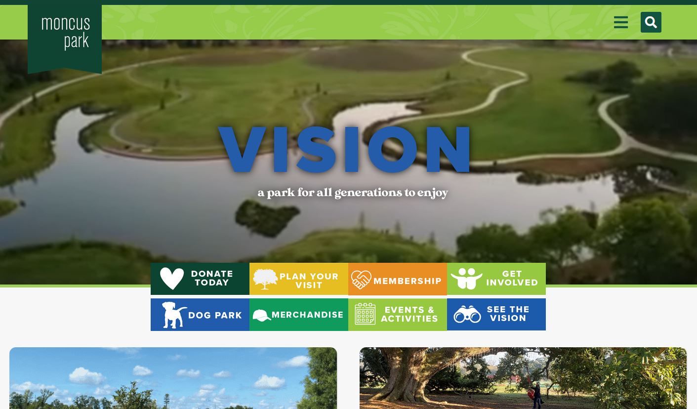
One website that does a great job of considering their audience is Moncus Park. They are a park that has a mission to serve the community. And making sure that the community can find their park and understands their community offerings is a key component of that mission.
In the end, your website is about serving your community of focus. Either through garnering donations, telling your story, or sharing what your community needs. You can also learn more about what your community needs with in-depth reporting and automation with Giveffect. Schedule a demo to learn more: